Stop scrolling, start creating. Understand the foundational principles behind every major living room aesthetic—with adaptable color guidance, furniture considerations, texture strategies, and thoughtful adaptations—so you can design a space that feels authentically yours, grounded in intention rather than fleeting trends.
You’ve spent hours saving images, wondering why your living room still feels disjointed. That curated bookshelf clashes with the sofa’s silhouette. The vintage rug you cherish competes with the wall art above it. This isn’t a reflection of your taste—it’s a sign you’re missing the foundational framework. True style emerges not from copying a single image, but from understanding the underlying principles that create harmony: spatial flow, material dialogue, emotional resonance, and functional alignment. This guide thoughtfully examines 15 distinct living room aesthetics through their core philosophies, historical context, and adaptable execution strategies. You’ll gain clarity on how color influences mood, why scale affects comfort, and where flexibility supports real-life living—transforming uncertainty into confident, personalized decision-making. No vague inspiration: just clear, actionable insight.
Introduction: Why “Style” Is More Than Just a Mood Board
Walk into a thoughtfully designed living room, and you sense its character before naming its style: calm, welcoming, energizing, grounded. This feeling arises from intentional choices working in concert—choices shaped by design history, cultural evolution, and human-centered considerations. The living room itself has transformed significantly: from the formal Victorian parlor (reserved for guests) to the mid-century family room (born of suburban expansion) to today’s fluid hub for connection, rest, and daily life. Design historians note how contemporary preferences often reflect broader cultural shifts—hygge resonates amid digital saturation; Japandi speaks to a collective desire for mindful simplicity. Understanding this context isn’t academic trivia; it helps you select a direction that aligns with your rhythms and values, not just algorithmic trends. This guide moves beyond superficial labels (“boho,” “modern”) to explore the operational logic of each aesthetic. You’ll learn how spatial constraints inform choices, why certain materials foster comfort, and how to adapt principles to your unique reality—turning overwhelm into clarity. Your journey begins not with shopping, but with understanding.
The Harmony Framework: Your 3-Step Path to Authentic Style Selection
Before exploring specific styles, establish a personal foundation. Skipping this step often leads to spaces that feel visually appealing yet functionally misaligned—like wearing beautifully tailored clothing that doesn’t suit the occasion. The Harmony Framework guides you to align aesthetic choices with lived experience.
Step 1: Observe How Your Space Is Truly Used
Set aside a few days to quietly note how your living room functions. Consider:
– Traffic Flow: Where do people naturally move? Where do conversations pause? (Lightly marking pathways with removable tape can reveal patterns.)
– Primary Activities: Reflect on frequency: relaxation (reading, screen time), social connection, focused work, family interaction, or hosting guests.
– Current Frictions: “The seating arrangement makes conversation difficult,” “Afternoon sun creates screen glare,” “There’s no dedicated spot for everyday items without cluttering surfaces.”
– Emotional Intention: Complete this thought: “When I enter my ideal living room, I feel ______.” (Calm? Inspired? Connected? Restored?)
Why this matters: A highly layered Maximalist approach may feel stimulating yet overwhelming if your primary need is post-work tranquility. Conversely, an extremely sparse Minimalist arrangement might feel isolating in a home where nightly family connection is central. Function anchors aesthetics.
Common consideration: Avoid anchoring your entire direction around one beloved item without evaluating its role in daily life. If a vintage rug is non-negotiable, later sections will show how to thoughtfully integrate it within a cohesive whole.
Practical note: This reflection requires no budget—only mindful observation. It prevents misaligned investments and supports choices that serve your reality.
Step 2: Acknowledge Your Space’s Physical Reality
Document your room’s inherent characteristics—they shape what’s feasible and harmonious:
– Dimensions & Proportions: Note length, width, ceiling height (critical for furniture scale).
– Architectural Elements: Windows (size, direction, view), doors, fireplaces, built-ins, columns, or sloped ceilings.
– Light Quality: North-facing light offers cool consistency; south-facing provides warm intensity; east brings morning glow; west delivers strong afternoon sun. Note areas prone to glare.
– Adjacent Zones: What connects visually? (Kitchen finishes? Hallway art?) Cohesion across open areas supports flow.
Why this matters: Low ceilings (under 8 feet) may feel constrained with heavy crown molding or deeply saturated walls. Large sun-exposed windows benefit from UV-protective textiles regardless of style direction. Open-plan layouts thrive with palettes and materials that create visual continuity—styles like Scandinavian or Modern Farmhouse often excel here through neutral, flowing foundations.
Illustrative adaptation: A preference for moody, library-inspired aesthetics in a compact, north-lit room might adapt by using warm taupe walls instead of deep charcoal, incorporating rich textures (velvet seating, woven throws), warm wood tones, and layered task lighting to evoke the desired ambiance without sacrificing perceived space or light.
Practical suggestion: Photograph your empty room. Print it. Sketch potential layouts with colored pencils. This tactile exercise often reveals spatial insights digital tools overlook.
Step 3: Clarify Your Personal Style Spectrum
Style rarely exists in pure isolation. Most people resonate with elements across multiple aesthetics. Define your spectrum:
– Core Anchor (≈60%): The dominant direction reflecting your deepest values (e.g., sustainability → Scandinavian; heritage appreciation → Traditional).
– Complementary Layer (≈30%): A secondary influence adding dimension (e.g., Anchor: Modern; Layer: Biophilic for nature connection).
– Accent Spark (≈10%): A subtle, intentional detail for personality (e.g., a single geometric mirror in an otherwise serene Japandi space).
Why this matters: This approach honors complexity while preventing visual dissonance. Environmental psychology research suggests spaces reflecting multifaceted identities can support greater emotional comfort and reduce cognitive friction.
How to apply it: Collect 8–10 images that genuinely resonate (beyond surface “prettiness”). Identify recurring motifs: “organic curves,” “raw wood textures,” “earth-toned palettes,” “asymmetrical balance.” These patterns signal authentic alignment.
Common consideration: Forcing rigid adherence to one “pure” style often feels restrictive. Authenticity frequently lives in thoughtful integration. A Modern Farmhouse foundation with one meaningful globally inspired textile tells a richer story than strict uniformity.
The Guiding Principle: A living room flourishes when aesthetics serve human experience—supporting how you live, rest, and connect—rather than demanding conformity to an external ideal.
The 15 Living Room Styles Decoded: Principles for Thoughtful Execution
Each style below is explored through its core philosophy, adaptable palette guidance, material considerations, lighting approach, common adaptations, and intentional execution tips. This structure emphasizes understanding why choices work, empowering you to adapt principles to your context.
1. Scandinavian
Core Philosophy: Human-centered design prioritizing light, function, and connection to nature. Emerging from Nordic climates, this approach values warmth, accessibility, and objects that serve purpose or bring quiet joy (hygge). It embraces meaningful simplicity—not emptiness.
Palette Guidance: Foundations lean toward warm off-whites (avoiding stark cool tones), soft greiges, and light wood hues. Accents may include muted sage, dusty clay, or oat. Specific paint names vary by region and batch; testing physical samples in your space is recommended.
Furniture Considerations: Low-profile silhouettes with visible light wood legs (ash, birch, light oak), modular storage, ergonomic seating. Scale remains modest to preserve airiness.
Textures & Materials: Natural fibers dominate—linen curtains, sheepskin or wool throws, jute rugs, untreated wood grain. Texture provides warmth where color remains restrained.
Lighting Approach: Layered sources are essential. Paper pendants, sculptural floor lamps, discreet wall sconces. Warm-white bulbs (2700K–3000K) soften shadows without glare.
Common Adaptations:
– Avoiding sterility: Introduce tactile textiles (a chunky knit throw per seating zone) to invite warmth.
– Wood tone harmony: Prioritize consistency in wood finishes; avoid mixing distinctly warm and cool tones unintentionally.
– Scale awareness: Oversized furniture can overwhelm the intentional openness. Measure carefully against room dimensions.
Thoughtful Execution: Incorporate living greenery at varying heights (floor, surface, shelf) to honor biophilic roots. Budget-friendly path: Refresh thrifted light wood furniture with gentle sanding and natural oil; explore accessible lines known for clean silhouettes and natural materials.
2. Modern Farmhouse
Core Philosophy: Contemporary comfort rooted in rustic authenticity. A modern interpretation blending rural warmth with clean-lined practicality. It embraces “lived-in” character over sterile perfection, favoring approachability.
Palette Guidance: Creamy whites, warm greiges, and soft taupes form the base. Black (matte finish) provides contrast. Sage green or muted terracotta may appear sparingly as accents.
Furniture Considerations: Rolled-arm sofas in durable fabrics, reclaimed-look wood tables (showing natural grain), slipcovered armchairs, shaker-style built-ins. Pieces feel substantial yet inviting.
Textures & Materials: Linen or cotton slipcovers (slight texture welcomed), chunky knits, vintage-inspired textiles, braided natural fiber rugs. Texture suggests handcraft and history.
Lighting Approach: Matte black iron fixtures—tiered pendants, gooseneck sconces, oversized floor lamps. Avoid high-gloss finishes for authenticity.
Common Adaptations:
– Avoiding thematic overload: Focus on material honesty (real wood grain, linen texture) rather than decorative props (signage, galvanized buckets).
– Wood tone cohesion: Limit visible wood tones to two complementary shades (e.g., light oak floors with a medium walnut table).
– Proportional balance: In compact rooms, scale down dominant pieces—a console behind the sofa may work better than a large farmhouse table.
Thoughtful Execution: Slipcovered seating embodies the style’s adaptable spirit. Budget path: Refresh existing wood furniture with matte black paint on legs/frames; use heavyweight cotton drop cloths for DIY slipcovers.
3. Japandi
Core Philosophy: Mindful synthesis of Japanese wabi-sabi (beauty in imperfection) and Scandinavian functionality. A philosophy of quiet intentionality, celebrating negative space (ma), natural materials, and purposeful restraint.
Palette Guidance: Warm off-whites, soft clay, light ash wood. Accents draw from earth: charcoal, indigo, muted terracotta. Colors feel derived from natural sources.
Furniture Considerations: Low-slung profiles, minimalist storage (tansu-inspired chests), asymmetrical wood tables, floor-level seating options. Furniture is sparse—only what serves a clear need.
Textures & Materials: Raw linen, undyed cotton, hand-thrown ceramics, washi paper elements, tatami-inspired rugs. Texture is subtle, tactile, never visually loud.
Lighting Approach: Diffused and indirect. Paper lantern pendants, hidden cove lighting, simple wood-based task lamps. Avoid harsh direct downlights.
Common Adaptations:
– Cultural respect: Focus on universal principles (asymmetry, natural materials, negative space) rather than using culturally specific sacred objects as decor.
– Embracing space: If surfaces feel crowded, pause. Japandi thrives where emptiness allows objects to breathe.
– Warmth integration: Counter potential coolness with one intentional textured element per zone (e.g., a nubby wool throw).
Thoughtful Execution: Before adding any object, consider its contribution to calm. This mindful pause embodies the style’s intentionality. Budget path: Transform a simple wood crate into a side table with light sanding and natural oil; use thrifted ceramic vessels for functional storage.
4. Mid-Century Modern (MCM)
Core Philosophy: Optimistic fusion of organic form and honest materials. Rooted in 1940s–1960s innovation, it celebrates geometric shapes, tapered lines, and seamless indoor-outdoor connection.
Palette Guidance: Warm whites, walnut wood tones. Accents include earthy mustard, olive green, burnt orange, or teal—used deliberately, not abundantly.
Furniture Considerations: Tapered legs are characteristic (on sofas, chairs, tables), low-profile silhouettes, kidney-shaped or organic coffee tables, modular shelving. Legs remain visible—skirted furniture diverges from the aesthetic.
Textures & Materials: Wool bouclé (ethically sourced alternatives available), geometric textiles, teak or rosewood grain (or sustainable alternatives), abstract patterns.
Lighting Approach: Sculptural forms: Sputnik-inspired pendants, arc floor lamps, globe fixtures. Materials include brass, smoked glass, spun metal.
Common Adaptations:
– Contemporary integration: Blend vintage-inspired pieces with modern neutrals to avoid a “period room” feel.
– Scale harmony: MCM furniture sits lower; pairing with very tall traditional pieces can create visual tension.
– Color restraint: One bold accent color per space often suffices. Multiple competing hues may dilute impact.
Thoughtful Execution: The tapered leg is a reliable silhouette indicator. Budget path: Seek solid wood furniture with tapered legs at secondhand markets; refresh with careful refinishing. Many contemporary retailers offer accessible pieces inspired by MCM forms.
5. Bohemian (Boho)
Core Philosophy: Curated eclecticism celebrating global craftsmanship and personal narrative. Rejects rigid rules in favor of layered meaning. Each object ideally carries significance—a market find, heirloom, or handmade piece. Intentional layering replaces randomness.
Palette Guidance: Jewel tones layered thoughtfully: emerald, ruby, sapphire, ochre, terracotta. Earth tones (olive, clay, indigo) ground the vibrancy. No single “base” color is required.
Furniture Considerations: Low-profile, sink-in seating; vintage trunks as coffee tables; floor cushions; macramé or woven accent chairs. Mixing eras and origins is encouraged.
Textures & Materials: Kilim or vintage rugs layered over natural fiber bases, embroidered textiles, fringed throws, crochet details, velvet accents. Texture is central to the experience.
Lighting Approach: Globally inspired: Moroccan metal lanterns, beaded fixtures, woven pendants, candlelight (flameless options recommended for safety).
Common Adaptations:
– Creating rhythm: Layering without cohesion can feel chaotic. Repeat one element (a shape like tassels, a color thread, or geometric pattern) to create visual connection.
– Ethical sourcing: Prioritize understanding the origin and significance of culturally specific items. Support artisan communities directly when possible.
– Functional balance: Ensure stable surfaces exist amid floor cushions for drinks or books.
Thoughtful Execution: Choose one meaningful item as an emotional anchor (a textile from travels, a family quilt). Build subsequent layers around its colors and story. Budget path: Thrift stores offer rich potential; explore natural dye techniques (onion skins for warm tones, avocado pits for soft pinks) for pillow updates.
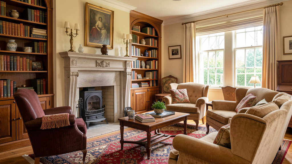
6. Traditional
Core Philosophy: Timeless elegance drawing from European design heritage (18th–19th century). Values symmetry, fine craftsmanship, and enduring comfort. Prioritizes hospitality and pieces designed to last generations.
Palette Guidance: Creamy whites, soft taupes. Accents include navy, forest green, burgundy, or subtle gold leaf details. Walls often remain neutral to showcase art and woodwork.
Key Furniture: Rolled-arm sofas (deep seats), wingback chairs, ornate wood coffee tables (cherry, mahogany, or quality alternatives), floor-to-ceiling bookshelves (glass doors optional).
Textures & Materials: Damask or toile patterns (often on a single accent wall or upholstery), silk-look or performance velvet drapes, Persian-inspired rugs, embroidered textiles.
Lighting Approach: Crystal or glass chandeliers (scaled appropriately), matching brass or nickel sconces, table lamps with fabric shades. Warm, layered illumination.
Common Adaptations:
– Softening formality: Maintain symmetrical furniture arrangement while introducing asymmetry through art placement or a casually draped throw.
– Light management: In smaller or darker rooms, counter deep wood tones with lighter wall colors and abundant layered lighting.
– Modern durability: Performance fabrics mimicking silk or velvet offer elegance with practicality for active households.
Thoughtful Execution: Pairing elements (two matching lamps, two armchairs flanking a sofa) creates inherent balance. Budget path: Refresh existing wood furniture with a soft cream paint and new hardware; use removable wallpaper for toile accents on a single wall.
7. Contemporary
Core Philosophy: Design reflecting current sensibilities—fluid, evolving, and context-aware. Distinct from “Modern” (a historical period), Contemporary embraces clean lines softened with organic curves, neutral foundations, and art as focal point.
Palette Guidance: True white, light gray, or warm beige bases. One bold accent color may appear sparingly (e.g., on a single chair or art piece).
Furniture Considerations: Low-profile modular sectionals, sculptural coffee tables (concrete-look, live-edge wood, or acrylic), minimalist media consoles. Lines are clean yet often incorporate gentle curves.
Textures & Materials: Performance fabrics, wool blend rugs, brushed metal finishes (brass, matte black), glass. Contrast in materiality creates interest.
Lighting Approach: Architectural and intentional. Recessed LED strips (where feasible), minimalist track lighting, statement floor lamps with geometric forms. Light functions as both utility and art.
Common Adaptations:
– Adding warmth: Counter potential coolness with organic elements—a live-edge wood stool, a hand-thrown ceramic vessel.
– Timelessness strategy: Anchor with simple, well-proportioned furniture; express current interests through easily changeable accents (art, textiles).
– Lighting layers: Avoid reliance on a single overhead source. Combine ambient (pendant), task (floor lamp), and accent (picture lights) layers.
Thoughtful Execution: In Contemporary spaces, art often serves as the emotional anchor. Let its palette inform subtle accent choices. Budget path: Frame children’s artwork or meaningful prints in matching simple frames for a curated gallery wall.
8. Industrial
Core Philosophy: Celebration of raw structure and utilitarian honesty. Inspired by adaptive reuse of factories and lofts. Highlights architectural bones—exposed elements, authentic materials—over applied ornament.
Palette Guidance: Concrete gray, exposed brick tones (real or high-fidelity alternatives), black steel. Warm wood tones and leather brown soften the palette.
Furniture Considerations: Leather or performance-fabric Chesterfield-style sofas, metal-framed tables with wood tops, pipe shelving units, vintage carts as side tables.
Textures & Materials: Distressed leather (or quality alternatives), heavy canvas, raw steel, authentic brick (or premium 3D panels), polished concrete-look flooring.
Lighting Approach: Edison bulb pendants (in clusters), cage lights, adjustable warehouse lamps. Visible bulbs and hardware are characteristic.
Common Adaptations:
– Adding warmth: Balance metal and concrete with wood tones, leather textures, and soft throws (wool, faux fur).
– Authenticity over imitation: If real brick isn’t feasible, prioritize high-quality alternatives or focus authenticity on lighting/furniture. Low-fidelity faux materials can undermine the aesthetic.
– Acoustic consideration: Hard surfaces amplify sound. Mitigate with area rugs, heavy curtains, and upholstered seating.
Thoughtful Execution: You need not expose ductwork. Select one authentic industrial element (a brick accent wall, black steel window frames) and build cohesively around it. Budget path: Refresh thrifted metal furniture with matte black spray paint; assemble simple shelving using pipe fittings from a hardware store.
9. Coastal
Core Philosophy: Serene evocation of seaside ease—light, airy, and effortlessly relaxed. Distinct from literal “nautical” themes (ropes, anchors). Focuses on the feeling: sun-bleached wood, gentle breezes, salt-air calm.
Palette Guidance: Crisp whites, sand tones, sea-glass blues. Driftwood gray and subtle coral (used minimally) add nuance.
Furniture Considerations: Slipcovered seating (washable linen-look fabric), rattan or wicker armchairs, light wood tables (bleached oak finish), built-in window seats with cushions.
Textures & Materials: Linen textiles, sisal rugs, rope-wrapped details, weathered wood finishes, sea grass baskets. Texture mimics natural coastal elements.
Lighting Approach: Woven rattan pendants, glass globe fixtures, simple brass or nickel sconces. Light feels diffused and gentle.
Common Adaptations:
– Avoiding thematic clichés: Focus on subtle suggestion (a single piece of sea glass, a linen texture) rather than literal motifs (ship wheels, life preservers).
– Fabric longevity: Sun exposure fades textiles. Consider UV-protective window film and fabrics labeled fade-resistant, especially in sunny rooms.
– Location-agnostic application: Inland? Emphasize the sensation (lightness, airiness) over literal beach references. A neutral palette with organic textures achieves the spirit.
Thoughtful Execution: Engage multiple senses thoughtfully. A diffuser with sea salt and sage essential oil near the entrance can gently reinforce the ambiance. Budget path: Paint existing furniture white; lightly distress edges with fine sandpaper. Thrift wicker baskets for textured storage.
10. Art Deco
Core Philosophy: Bold elegance celebrating geometric opulence and machine-age luxury. Peaked in the 1920s–1930s (Gatsby era, ocean liners). Defined by symmetry, sunburst motifs, stepped forms, and lavish materials.
Palette Guidance: Cream, charcoal, or deep taupe bases. Accents include emerald green, sapphire blue, black, and metallic gold (foil or quality finish). High contrast is characteristic.
Furniture Considerations: Tufted or channel-stitched seating, geometric coffee tables (lacquered wood, glass, or quality alternatives), tiered side tables, curved credenzas. Legs may feature flared or stepped profiles.
Textures & Materials: Velvet (in rich hues), high-gloss lacquer finishes, mirrored surfaces (safely mounted), chrome or brass accents, faux zebra print (used minimally).
Lighting Approach: Tiered crystal or glass pendants, sunburst mirrors with integrated sconces, geometric table lamps with silk-look shades. Light is dramatic and reflective.
Common Adaptations:
– Preventing overwhelm: Anchor with neutral walls; let two or three key Deco-inspired pieces serve as focal points.
– Scale sensitivity: A massive sunburst mirror may dominate a compact room. Select Deco elements proportional to your space.
– Finish quality: Thin metallic paints or flimsy mirrors can appear cost-effective but undermine the intended luxury. Prioritize quality finishes on focal items.
Thoughtful Execution: Geometry provides cohesion. Look for chevron patterns, stepped silhouettes, or circular motifs across textiles, art, and furniture. Budget path: Frame architectural prints in thrifted gold-toned frames; use removable metallic wallpaper on a single accent wall.
11. Rustic
Core Philosophy: Unpretentious appreciation of natural materials and handcrafted character. Rooted in mountain lodges, cabins, and rural traditions. Values visible grain, knots, stone texture, and evidence of making. Distinct from “shabby chic” (deliberately distressed).
Palette Guidance: Wood tones (cedar, pine), stone gray, cream. Accents include forest green, rust red, leather brown.
Furniture Considerations: Heavy timber frames, live-edge wood tables, stone fireplace surrounds (real or high-quality alternatives), antler-inspired lighting (ethically sourced faux recommended).
Textures & Materials: Wool plaid blankets, faux fur throws, burlap accents, rawhide details, river rock elements. Texture is rugged and tactile.
Lighting Approach: Antler chandeliers (faux), wrought iron sconces, lantern-style table lamps. Warm, flickering light (flameless candles enhance ambiance safely).
Common Adaptations:
– Avoiding thematic saturation: Authentic Rustic feels collected over time. Limit overt motifs; let materials speak.
– Light balance: Abundant wood on walls, ceiling, and floor can absorb light. Counter with light textiles, ample layered lighting, and reflective surfaces.
– Comfort integration: Rough-hewn wood furniture benefits from deep, supportive cushions in durable fabrics.
Thoughtful Execution: Incorporate one authentically rustic element—a reclaimed wood mantel, a stone accent wall—and balance with contemporary comforts (plush seating, modern lighting controls). Budget path: Refresh simple tables with wood stain to mimic live-edge character; choose ethically made faux antler decor.
12. Minimalist
Core Philosophy: Intentional reduction to reveal essence. Rooted in concepts of ma (negative space). Not emptiness, but curation. Every object should serve clear function or profound, lasting resonance. Rejects visual noise and impulsive acquisition.
Palette Guidance: True white, light gray, warm beige. One neutral accent (charcoal) or a single muted hue (sage) may appear sparingly.
Furniture Considerations: Built-in or low-profile seating with hidden storage, platform sofas, monolithic tables (concrete-look or wood), seamless cabinetry. Furniture acts as architectural element.
Textures & Materials: High-quality, undyed natural fibers: raw silk, heavyweight linen, wool felt. Texture conveys quiet luxury without pattern.
Lighting Approach: Recessed cove lighting (indirect), minimalist floor lamps (architectural forms), hidden task lighting. Fixtures recede; light defines space.
Common Adaptations:
– Infusing warmth: Counter potential sterility with one organic element—a single healthy plant, a hand-thrown ceramic bowl.
– Storage integrity: Minimalism relies on flawless storage solutions. Prioritize editing possessions or investing in seamless cabinetry.
– Human scale: Oversized minimalist furniture can feel imposing. Select pieces proportional to human use and room size.
Thoughtful Execution: Before introducing any item, consider: “Does this serve essential function or bring deep, enduring value?” If not, it may not belong. Budget path: Edit existing items rigorously. Paint walls and trim a unified warm white. Use one large-scale art piece to prevent visual fragmentation.
13. Eclectic
Core Philosophy: Confident curation of diverse elements unified by personal narrative. Not randomness. Requires thoughtful balance of color, scale, era, and texture to create cohesive individuality.
Palette Guidance: No fixed rules—but requires a unifying thread. Example: All colors pulled from a single vintage rug; or all accents in varying shades of one hue (e.g., blues).
Furniture Considerations: Intentional mixing: a Mid-Century chair beside a Traditional sofa, an Industrial cart as side table. Vary scale and silhouette to avoid monotony.
Textures & Materials: Layer patterns deliberately: geometric pillow on a floral sofa, ikat rug over sisal base. Texture often provides cohesion where pattern varies.
Lighting Approach: Mix styles purposefully: an Art Deco lamp on a Rustic stool, an Industrial pendant over a Modern table.
Common Adaptations:
– Creating cohesion: Without a unifying element, spaces can feel chaotic. Repeat one color, shape, or material throughout (e.g., all wood tones are walnut; all metal finishes are brass).
– Focal clarity: Designate one primary focal point (fireplace, art wall); subordinate other elements to avoid competition.
– Scale awareness: A delicate vintage chair beside a massive sectional creates imbalance. Scale relationships matter more than style labels.
Thoughtful Execution: Choose one multi-colored object (a kilim rug, a painting). Pull one hue for walls, one for large furniture, one for accents. This creates invisible harmony. Budget path: Thrift stores offer rich sourcing potential. Edit fiercely—keep only pieces that resonate deeply.
14. Biophilic
Core Philosophy: Science-informed integration of nature to support human well-being. Extends beyond adding plants. Based on established patterns of Biophilic Design (Terrapin Bright Green). Aims to reduce stress, enhance creativity, and foster connection.
Palette Guidance: Earth-derived tones—clay, moss green, sky blue. Wood tones and stone grays provide grounding.
Furniture Considerations: Organic shapes (kidney tables, curved sofas), natural materials (rattan, cork, reclaimed wood), small water features (indoor fountains).
Textures & Materials: Natural fibers exclusively where possible: hemp, organic cotton, wool, jute. Minimize synthetics in high-contact areas.
Lighting Approach: Maximizing daylight is priority. Supplement with full-spectrum bulbs (mimicking natural light), indirect sources to avoid glare.
Common Adaptations:
– Beyond token plants: True integration occurs at multiple levels: visual (diverse plant life), tactile (wood grain), auditory (water feature), olfactory (essential oils).
– Light quality: Harsh overhead lighting counteracts biophilic benefits. Layer ambient, task, and accent lighting with warm temperatures.
– Sustainable plant choices: Select low-maintenance species suited to your light conditions (snake plant, ZZ plant, pothos) to ensure longevity.
Thoughtful Execution: Apply the “prospect and refuge” principle: Arrange seating with a view (window, garden) while feeling sheltered (behind a sofa back, under a canopy light). This spatial arrangement supports psychological comfort. Budget path: Open curtains daily to maximize daylight; place a bowl of river rocks on a surface; use nature soundscapes during focused work.
15. Dark Academia
Core Philosophy: Moody intellectualism celebrating literature, history, and scholarly pursuit. Inspired by old university libraries, Gothic architecture, and vintage academia. Warm, inviting darkness—not cold or gothic.
Palette Guidance: Deep charcoal, chocolate brown, forest green. Accents include burgundy, antique gold foil, cream (for book collections).
Furniture Considerations: Chesterfield-style sofas (brown leather or quality alternative), floor-to-ceiling bookshelves (dark wood finish), vintage desks as consoles, wingback reading chairs with task lamps.
Textures & Materials: Velvet (in deep hues), leather-bound books (or well-loved paperbacks), wool tartan blankets, Persian-inspired rugs, brass library lights.
Lighting Approach: Warm, focused pools of light. Green glass banker’s lamps, adjustable brass wall sconces, candlelight (flameless for safety). Overhead lighting is minimized.
Common Adaptations:
– Avoiding gloom: Balance deep colors with warm undertones (chocolate over true black), visible wood grains, and abundant warm task lighting.
– Bookshelf curation: Books feel intentional when organized thoughtfully (by color, size, or subject) rather than chaotically.
– Modern integration: Blend comfortable contemporary seating with academic accents to support daily use.
Thoughtful Execution: Scent can deepen ambiance. An unlit cedarwood or old-book-scented candle on a shelf engages memory and enhances the scholarly atmosphere. Budget path: Paint walls a deep warm gray (not true black); style shelves with thrifted hardcover books; add a single vintage globe or map print.
Beyond the Label: The Art of Intentional Style Blending
Pure style adherence is uncommon—and often unnecessary. Personal identity is multifaceted; your space can reflect that complexity with strategy. Blending succeeds through intention, not accident.
The 60-30-10 Blending Framework:
– 60% Anchor Style: Provides structural harmony and calm. Example: Scandinavian (light wood floors, white walls, clean lines).
– 30% Complementary Style: Adds depth and functional resonance. Example: Biophilic (abundant plants, organic-shaped table, nature connection).
– 10% Accent Style: Offers subtle narrative surprise. Example: A single geometric Art Deco mirror above the sofa.
Why it works: The anchor creates visual rest; the complement enhances daily experience (Biophilic elements support well-being); the accent invites curiosity. Without this framework, blends risk feeling disjointed. With it, they feel curated and cohesive.
Harmonious Style Pairings:
| Anchor Style | Complementary Style | Why It Works | Blending Tip |
|——————-|———————|———————————————–|—————————————————|
| Scandinavian | Japandi | Shared values: simplicity, natural materials | Use Scandinavian furniture shapes with Japandi’s darker wood accents (walnut vs. ash) |
| Modern Farmhouse | Bohemian | Warmth meets global texture | Maintain Farmhouse’s neutral base; layer Boho textiles (kilim rug, embroidered pillows) |
| Contemporary | Industrial | Clean lines meet raw texture | Contemporary sofa + Industrial pipe shelving; soften with a wool rug |
| Traditional | Dark Academia | Heritage meets scholarly depth | Traditional layout; swap light walls for deep green; add library-style lighting |
| Minimalist | Biophilic | Calm meets vitality | Minimalist layout; integrate plants as architectural elements (floor-to-ceiling fiddle leaf fig) |
Essential Blending Guidelines:
1. Material Dialogue: When blending Rustic (wood) and Industrial (metal), repeat both materials intentionally. A wood coffee table and a metal lamp base create visual conversation.
2. Color Thread: Pull one color from your accent style into multiple small elements. Blending Coastal blue into a Traditional space? Echo it in throw pillows, a ceramic vase, and book spines.
3. Scale Respect: The anchor style’s furniture scale should dominate. A low-profile Mid-Century sofa pairs poorly with a towering Traditional armoire—they compete visually.
4. Edit Consciously: Blending adds visual complexity. Counterbalance with intentional negative space. Adding Bohemian textiles to a Modern room may warrant removing another decorative layer elsewhere.
Illustrative adaptation: A space honoring Scandinavian simplicity while reflecting cultural heritage might feature:
– 60% Scandinavian: Light oak floors, white walls, modular shelving.
– 30% Global Craft Influence: A handwoven textile rug (colors echoed in pillows), terracotta planters.
– 10% Personal Accent: Framed folk art print as focal art.
Result: A serene yet deeply personal environment. The key lies in using textile patterns and colors respectfully, anchored by Scandinavian structure, avoiding appropriation through mindful curation.
Real-World Constraints: Adapting Principles to Your Reality
Design ideals meet lived experience. These adaptations honor your constraints without sacrificing intentionality.
Small Spaces (< 200 sq ft)
Guiding Strategy: Enhance perceived space through verticality, reflection, and multi-function.
– Furniture Scale: Prioritize apartment-sized pieces. A loveseat over a full sofa; nesting tables over a large coffee table. Style note: In Traditional contexts, a settee may replace a sofa; in Industrial, a wall-mounted desk substitutes for a heavy cart.
– Color Strategy: Light, cool-leaning colors can make walls feel receding. Exception: For moody styles like Dark Academia, apply deep tones to only one accent wall; keep ceiling and opposing walls light to preserve airiness.
– Strategic Mirrors: Position opposite a window to amplify light and view. Style integration: Frame mirrors in material-appropriate finishes (light wood for Scandinavian; sunburst brass for Art Deco).
– Vertical Storage: Floor-to-ceiling shelves (Scandinavian-inspired systems) store books and display art. Under-sofa storage bins (concealed) hold blankets.
– Lighting Solutions: Avoid bulky floor lamps. Opt for wall sconces (Modern Farmhouse gooseneck style) or slim arc lamps (Mid-Century inspired). Plug-in sconces require no hardwiring.
Budget Consideration: Painting trim and doors the same color as walls creates visual continuity, reducing “chopping” of space. Cost: minimal additional paint.
Open-Plan Layouts (Living + Kitchen + Dining)
Guiding Strategy: Define zones without walls using rugs, lighting, and arrangement.
– Rug Anchoring: Each functional zone benefits from its own rug. The living area rug should be large enough for front sofa legs to rest upon. Style note: In Eclectic spaces, layer a smaller vintage rug over a larger neutral sisal base.
– Lighting Layers: Different zones require distinct light. Living area: warm ambient (pendants). Dining: focused task light (fixture 30″ above table). Kitchen: bright task lighting. Style integration: Maintain consistent fixture finishes (all matte black for Industrial; all brass for Traditional) while varying forms for interest.
– Furniture as Soft Divider: Position sofa back toward dining area; use a low console table behind it for separation without blocking sightlines. Critical: Carry consistent wood tones or metal finishes across zones for cohesion.
– Color Flow: Employ a unified 3-color palette across the entire space. Walls: neutral base. Large furniture: secondary color. Accents: tertiary color. This creates rhythmic continuity.
Practical Tip: Stand at the main entrance. What’s the first focal point? Ensure adjacent zones support this visual anchor.
Family Homes (Kids, Pets, High Traffic)
Guiding Strategy: Prioritize durability, cleanability, and flexible layouts.
– Fabric Selection: Performance fabrics (Crypton, Sunbrella, Revolution) resist stains, moisture, and odors. Style adaptation:
– Traditional: Performance velvet offers luxurious appearance with practical cleanability.
– Bohemian: Indoor/outdoor rugs mimic kilim patterns with easy maintenance.
– Modern Farmhouse: Slipcovers in performance linen-look fabric (machine washable).
– Layout Flow: Maintain clear pathways. Avoid fragile coffee tables; choose ottomans with storage (soft edges, hides toys). Round tables reduce bump risks.
– Accessible Storage: Built-ins with doors conceal clutter. Baskets labeled with images (for pre-readers) encourage child participation. Style note: In Scandinavian spaces, use colorful bins matching your accent palette.
– Flooring Strategy: Hard surfaces often suit high-traffic zones. Luxury vinyl plank (LVP) mimics wood, is waterproof, and soft underfoot. Area rugs define zones and add comfort.
Safety Priority: Anchor tall furniture (bookshelves, media units) to wall studs following current safety guidelines. This is a non-negotiable safety practice.
Budget Path: Pegboard systems (painted to match walls) create customizable, child-accessible storage. Refresh solid wood furniture with non-toxic, high-gloss paint for easy wiping.
Budget-Conscious Execution: Integrity at Every Level
Tiered Investment Approach:
| Category | Consider Splurging On | Budget-Conscious Alternative |
|————|——————————–|——————————————–|
| Sofa | Solid wood frame, quality suspension, performance fabric | Well-constructed modular sofa with washable covers; elevate with quality throw pillows |
| Rug | Hand-knotted wool (longevity) | Machine-washable rug system; layer over inexpensive natural fiber base for texture |
| Lighting| Restored vintage fixture; quality new piece | Thrifted lamp refreshed with matte spray paint and new linen shade |
| Art | Original local artist | Frame meaningful personal art; print public domain works from museum collections; create gallery wall with thrifted frames painted uniformly |
| Textiles| Belgian linen curtains | Linen-look curtains; hem to precise length for tailored appearance |
Universal Budget Principles:
1. Paint Transforms: One gallon of paint refreshes dated furniture, creates an accent wall, or unifies thrifted frames. Test samples first.
2. Edit Before Acquiring: Remove three items from your current space. Rearrangement often creates renewed appreciation without cost.
3. Thrift with Focus: Visit with a specific mission: “Find one brass lamp for Traditional styling” or “Find a light wood chair for Scandinavian adaptation.”
4. DIY Within Skill: Only undertake projects matching your ability. A poorly executed paint job may detract. Start small: reupholster a single dining chair.
5. Patience as Strategy: Maintain a “style wish list.” Wait for sales, secondhand gems, or seasonal discounts. Authentic style evolves thoughtfully—it need not be instantaneous.
Your Questions, Answered
Q: How do I choose a direction if my partner and I have different aesthetic preferences?
A: Begin with the Harmony Framework’s Life Audit (Step 1). Identify shared functional needs: “We both need space for board games,” “We require durable surfaces for our pet.” Let shared function guide the anchor style (e.g., Modern Farmhouse for warmth and durability). Then, allocate personal expression zones: one bookshelf for cherished books, one wall for preferred art. Compromise on large foundational pieces (sofa, rug); personalize through accessories each person influences. The goal is a space serving both of you, not perfect stylistic replication.
Q: Can modern furniture coexist with antique pieces without visual chaos?
A: Yes—and this often creates the most resonant spaces. Create intentional connection: repeat a material (the wood tone of an antique table echoes in modern chair legs) or pull a color from the antique’s patina into a modern pillow. Position the antique as a deliberate focal point (e.g., vintage trunk as coffee table in a Contemporary room), letting modern pieces support it. Avoid placing multiple competing antiques side-by-side; allow one to shine. Simplify surrounding elements to give the antique visual breathing room.
Q: My living room has challenging lighting (single overhead fixture, north-facing window). How can I adapt any style?
A: Address lighting foundational needs first. Layer three types:
1. Ambient: Replace harsh overhead with a dimmable LED panel or add plug-in wall sconces (no wiring).
2. Task: Position an adjustable floor lamp beside seating.
3. Accent: Use battery-operated LED puck lights inside shelves or picture lights.
For cool north light, use exclusively warm-white bulbs (2700K). Place mirrors opposite the window to amplify available light. In style execution: Choose lighter wall colors (even within moody palettes—opt for deep taupe over true black), and incorporate reflective surfaces (glass table, metallic accents) to enhance luminosity. This adapts style intelligently to your space’s reality.
Q: How do I avoid my room feeling “dated” in a few years?
A: Build on timeless foundations; express trends through flexible elements. Invest in:
– Neutral wall colors (warm whites, soft greiges)
– Classic furniture silhouettes (rolled arms, tapered legs)
– Natural materials (wood, wool, cotton)
Then, refresh through easily changeable layers:
– Pillow covers
– Throw blankets
– Art prints
– Small decor objects
A room grounded in quality materials and thoughtful proportion transcends fleeting trends. Seasonal accent updates maintain freshness without major investment.
Q: Is “Transitional” a legitimate style, or just indecision?
A: Transitional is a valid and highly functional approach—especially for those finding pure Traditional too formal or pure Contemporary too austere. It bridges the two: Traditional furniture shapes (rolled arms, wood frames) executed with Contemporary restraint (cleaner lines, neutral fabrics). Example: A classic Chesterfield sofa in performance charcoal fabric; a Traditional-style console in matte black finish. It’s not indecision; it’s a deliberate choice for balanced, adaptable elegance that supports evolving lifestyles.
Q: How many colors should appear in my living room?
A: The 60-30-10 ratio provides reliable guidance:
– 60% Dominant: Walls, large rug, primary sofa
– 30% Secondary: Armchairs, curtains, secondary rug layer
– 10% Accent: Pillows, art details, small decor
This prevents visual fragmentation. Exception: Bohemian or Eclectic directions may incorporate more colors, but they’re unified by a consistent neutral base (cream, beige) or repeating pattern motif. When uncertain, pull all colors from a single inspiration piece (a rug, a painting) to ensure inherent harmony.
Q: What’s the most common sofa selection mistake?
A: Overlooking scale and proportion relative to room size and human comfort. Always measure your space and doorway access before purchasing. Maintain 18–24 inches of clearance for walking paths. Seat depth matters: under 22″ suits upright seating (Traditional); 24″+ supports sink-in comfort (Modern Farmhouse). Test seat height: knees should align near hip level when seated. Purchasing without these measurements risks a piece that overwhelms the space or proves uncomfortable for daily use.
Q: How do I thoughtfully incorporate family heirlooms that don’t match my chosen direction?
A: Honor the object’s story without forcing stylistic conformity. Position it as an intentional focal point: a folded heirloom quilt at the end of a Contemporary sofa; a vintage trunk serving as a coffee table in a Rustic-inspired space. If integration feels jarring, display it thoughtfully elsewhere (entryway, bedroom) where it receives dedicated attention. The goal isn’t concealment but meaningful placement that respects both heritage and current living needs. Sometimes, the heirloom becomes the style anchor—build the room’s palette around its colors and narrative.
Q: Are area rugs essential? Can I skip them to save funds?
A: Rugs serve three key functional roles:
1. Define Space: Critical in open layouts to anchor the seating area visually.
2. Improve Acoustics: Hard floors create echo; rugs absorb sound significantly.
3. Add Comfort: Bare floors feel cool underfoot; rugs provide texture and warmth.
Budget solution: Machine-washable rug systems offer affordable entry points. Layer a smaller vintage rug (thrifted) over a larger neutral sisal base for instant depth and value. Omitting a rug often leaves a room feeling acoustically harsh and visually unfinished—prioritize this before decorative accents.
Q: How often should I refresh my living room decor?
A: There is no mandated timeline—refresh when you feel a shift in need, not due to external pressure. Signs it may be time:
– Function no longer supports your life (e.g., household size changed)
– Colors or arrangements evoke stress rather than calm
– Items are worn beyond safe or comfortable use
Instead of full overhauls, practice “seasonal editing”: swap pillow covers for holidays, rotate art seasonally, introduce fresh greenery in spring. This maintains connection without constant expense. A thoughtfully designed room built on authentic principles should provide lasting joy; minor, intentional updates sustain that relationship.
Conclusion and Your Next Step
You now hold a framework for intentional living—not just a style catalog. We’ve explored the principles behind 15 aesthetics, provided the Harmony Framework to align design with your life, and shared adaptable strategies for real-world constraints. Remember this core truth: Style’s highest purpose is resonance. A room reflecting your values, supporting daily rituals, and honoring your story—even with thoughtfully sourced secondhand pieces—is infinitely more meaningful than an impersonal, magazine-perfect replica.
Your Three Anchors
- Observe Before Acting: Your lived experience and spatial reality are the true foundation. Honor them first.
- Blend with Purpose: Use the 60-30-10 framework to weave complexity into harmony. Your uniqueness is your greatest design asset.
- Prioritize Living Over Perfection: A coffee table bearing traces of shared meals holds more value than an untouched showroom piece. Design for real life.
The 24-Hour Step: One Small, Meaningful Action
Within the next day, choose one:
– If feeling overwhelmed: Spend 10 minutes observing your room’s natural traffic flow. Note one friction point.
– If uncertain about style: Collect 5 images that genuinely resonate (beyond surface appeal). Circle one recurring element (e.g., “organic curves,” “warm wood”). That’s your authentic signal.
– If navigating constraints: Measure the doorway clearance for your largest planned furniture piece. Knowledge reduces future stress.
This isn’t about completing your room tomorrow. It’s about building momentum through one deliberate, compassionate step. Progress compounds.
The Living Perspective
Your space will evolve—as you do. New chapters, shifting priorities, growing families: your room can adapt with grace. Return to this guide not as a rigid rulebook, but as a reference for intentional choices. Edit freely. Celebrate imperfections. Let a child’s drawing framed beside vintage art tell a truer story than curated uniformity. The most successful living rooms aren’t those that perfectly execute a style label. They’re the ones where laughter flows easily, quiet moments feel sacred, and every object—from the well-loved sofa to the meaningful heirloom—whispers, “This is us.” You have everything you need to begin.
Explore Our Complete Home Design System:
The Living Room Lighting Layering Guide: Ambient, Task & Accent Mastery | Furniture Scale Secrets: Choosing Pieces That Fit Your Space and Life | The Color Confidence Method: Selecting Hues That Enhance Mood and Flow | Sustainable Style: Building a Beautiful Room That Honors People and Planet | Small Space, Big Impact: Layout Strategies for Apartments and Cozy Homes | The Mindful Edit: A Compassionate Approach to Decluttering | Texture Mapping: Layering Fabrics for Depth, Comfort, and Visual Harmony